About the Project
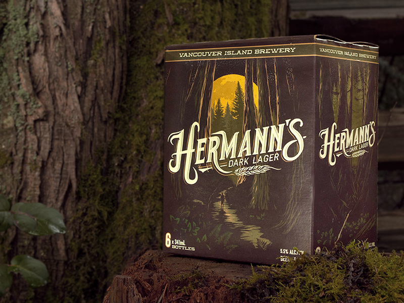
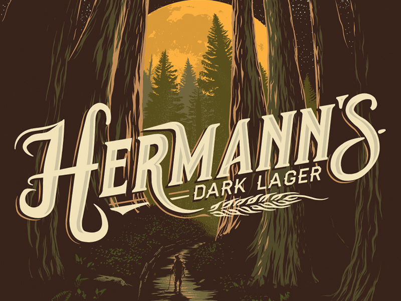
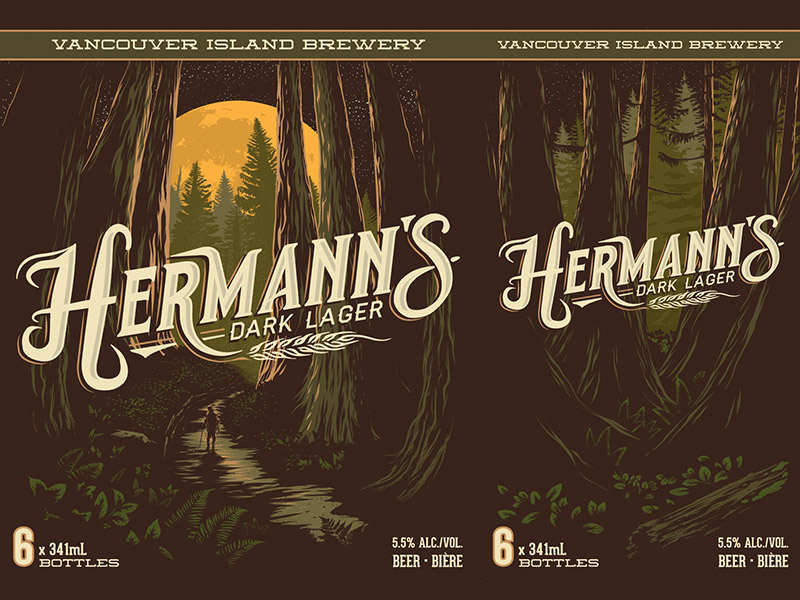
This project was part of a re-branding for Vancouver Island Brewery’s core brands. I worked on this with McAllister Marketing. The goal for all the artwork for the core brands was to celebrate the Island landscapes. For this brand we chose to highlight Vancouver Island’s old growth forests. As Hermann’s is a dark beer we decided that a night scene would be best. All of the cases for the core brands are continuous scenes that wrap around the case.
Details
Client: McAllister Marketing / Vancouver Island Brewery
Format: Print